The Menu
I designed a new menu experience for Scratch Kitchen’s catering platform that simplified decision-making across multiple restaurant brands. The redesigned structure unified all items into a single, filterable menu, reducing redundancy and cognitive overload while supporting both group and administrative ordering.
-
Lead UX Designer for research, UX, and UI.
-
Scratch Kitchen is a clean-label food delivery platform that exclusively features natural and organic restaurants made in-house and from scratch.
Customers are empowered to choose from a huge selection of sustainable and highly customizable food, all purchased in a single checkout.
-
Scratch Kitchen’s catering business had potential but suffered from a poor user experience that drove customers to third-party platforms like ezCater. We designed a custom catering and group ordering platform that made large orders simple to place and manage, helping Scratch Kitchen reclaim revenue, strengthen its brand experience, and scale its catering business.


Overview
Challenge
Research
Usability Testing
Solution
The purpose of “The Menu” project was to design the user experience and interface for viewing and selecting the items available on Scratch Kitchen’s catering platform.
The menu must accommodate two user types:
Administrative users are responsible for placing the order. They can either create the cart for their entire group or share a link with each group member, allowing them to add their own meal to the cart. This user may be an office administrator or manager.
Group Members: group members are responsible for adding their meals to the administrative user’s cart.
“The Menu” project was particularly challenging for two reasons:
Scratch Kitchen’s menu is extremely unique. Like other food delivery platforms, their website features many different restaurant brands. However, the Scratch Kitchen customer can create a single order that includes items from any combination of these brands. Therefore, we found that conventional menu styles were not suitable and we were required to bet on a brand new menu design to accommodate the distinctive business model.
Scratch Kitchen's multi-brand ordering system offers the customer many options, which risks exposing them to negative effects tied to the paradox of choice.
I utilized several different research methods and sources to inform the design of this experience. Below you will find the most interesting and relevant insights from each.
-
Source Overview
The original Scratch Kitchen website is a white label site that aims to address the UX challenges posed by Scratch Kitchen's distinctive business model and menu. However, we knew from our customers that this menu was problematic, so I decided to investigate.
Although this site is not specifically for catering, it features the same menu as the catering platform, so it was clear that usability testing would reveal insight. I structured the test so that some users were selecting a meal for themselves, like a group member, and some were selecting food for a group of people, like an administrative user.
A screenshot of the white label site’s menu is shown below.
As you can see, this site uses a horizontally scrolling tab design to separate the menus for each brand.
Insights and Learnings
The following insights apply to desktop and mobile for both user types.
The separated brand menus indicated to some users that, like most food delivery platforms, they could not order across multiple brands in the same checkout.
Users were frustrated when they couldn’t view an entire category, like “Sides”, and instead had to find and independently browse each brands’ individual “Sides” categories. This made it harder for users to make decisions, because there wasn’t an easy way to view and compare their options.
Users were confused and frustrated by redundant menu items and categories. Some asked about the difference between each version of an item, even though they were viewing the same item listed multiple times. For instance, Hand Cut Fries were available in multiple "Sides" categories.
Users liked that they could see the dietary preferences associated with an item, but were frustrated that they could not view only the items that adhered to their preferences.
Users looked for and could not find allergen information.
Users looked for and could not find nutritional information.
Users were frustrated by the search feature. Many tried to search category related terms, like “Soup” or “Breakfast”, or dietary preferences, like “Vegan”, and were confused or disappointed when no results were returned.
-
Source Overview
The white label site featured robust Google analytics tracking, which I analyzed in search of insights relevant to the menu.
Insights and Learnings
The search feature saw high drop off rates and often returned no results. The term with the most searches was “Soup”, which only returns items with “Soup” in its name. The second most popular search term was “Beverages”, which returned zero results.
Items with a “Customer Favorite” tag saw more clicks than other items in their category, independent of where they were listed in the category.
On mobile, there was a dramatic drop off in brand clicks after the first four brands (there are only four in the viewport on load). This drop off point did not occur on desktop.
Dietary preferences ending in “Optional”, like “Vegan Optional” were rarely utilized.
-
Source Overview
The Baymard Institute conducts original large-scale research studies on all aspects of the online user experience, with a heavy focus on e-commerce. They currently have 110,000+ hours of research compiled into an actionable and user-friendly format.
I persuaded Scratch Kitchen’s CTO to invest in this research, so that we could focus our own testing on the elements of the site that are unique to our business. It was in our best interest to avoid spending our limited resources reinventing the wheel.
However, the menu design was very unique to our business, so this resource was not as helpful as it was with the other projects in the MVP.
Insights and Learnings
Customizing items is a complex part of ordering food. Many food customization designs can cause confusion and cart abandonments among users. Traditional checkboxes and radio buttons for selecting required and optional food customizations performed best during usability testing.
“Load More” button loading schemas performed best during testing for long menus.
Product filters increase the conversion rate for typical e-commerce sites.
Informed by the research above, I designed four different menus and tested each with users.
-
First, we tested a design resembling a typical food delivery platform. This design rigidly separated restaurant brands and encouraged the user to choose a brand at the beginning of their journey. We hypothesized that this rigid design could help segment Scratch Kitchen’s lengthy menu and present the company as a platform. However, this menu style did not perform well during usability testing, as it made it difficult for users to order across restaurant brands.
-
We also tested a more standard digital menu design, which simply presents a list containing menu categories and the items within them. Although the familiarity of this design was beneficial, usability testing revealed that this style did not suit Scratch Kitchen's menu for two reasons. Firstly, it did not include brand representation. Testing indicated that this could negatively affect the company’s primary customer acquisition strategy, which involves listing each brand independently on third-party delivery platforms and then converting those customers to their native website. Secondly, the sheer length of Scratch Kitchen's menu made this display overwhelming to customers and made it difficult for them to make decisions.
-
Another option was to imitate the structure of the original Scratch Kitchen website. However, we knew from usability testing this site during the research phase that replicating its structure on the catering platform would not be a wise approach.
-
Ultimately, usability testing revealed a brand new menu design as the the clear winner. This design adhered closely to the insights and learnings from the preliminary research stage.
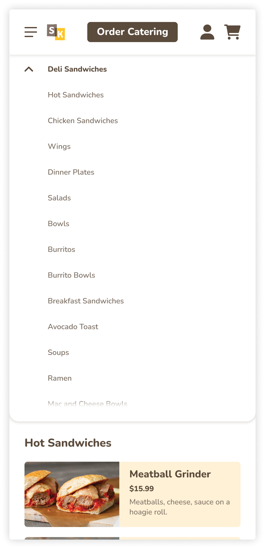
The winning design features one all-encompassing, vertically scrolling menu that combines all items from each brand and distributes them into unique menu groups. With this design, users have the option to browse menu groups containing items from all different brands or explore a specific brand by filtering the entire menu.
This new structure is more similar to an e-commerce site like target.com, where the user can filter products by the many different brands that Target sells, or they can browse entire categories, like “Men’s Shirts'“, that contain products from a variety of different brands.
This structure addresses many of the issues observed while testing the other three designs:
It eliminates the rigid separation of brands, especially in its default state. This makes ordering across brands more clear and intuitive.
It eliminates redundancy. All items and menu groups are only listed one time, but filters still allow users to browse by brand if desired. For example, there is not a “Salads” menu group under both Bittersweet and Greenlight. Instead there is one “Salads” group that can be filtered by Bittersweet or Greenlight. Eliminating redundancy helps to combat the paradox of choice by shortening the menu and by making it easier for the user to understand and compare all of their options within a single category.
The restaurant brand filter is the most visually prominent filter, which supports Scratch Kitchen’s customer acquisition strategy, as many of their new users will have previously ordered from one specific brand, like Greenlight, on a third-party delivery platform, like UberEats.
Narrowing Down the Menu
Although this structure already helps to combat the paradox of choice by eliminating redundancy, the winning design features tools to help users narrow down the menu and make decisions.
Filters
The first release included four filters: allergens, dietary preferences, cuisine type, and star rating. I selected these filters by reviewing customer surveys that we sent out earlier in the year, which asked customers what was most important to them when picking something for takeout. In a future iteration, we will consider customizing the filters to the user type, so that administrative users see different filters, like budget and packaging style.
Search
Usability testing the white label site pointed out the serious flaws in its search feature, but it also alerted us to how important of a tool it was for such a long menu like Scratch Kitchen’s. Many of the users involved in testing tried to use the search feature within a few minutes of entering the menu.
I ensured that the new search feature handled various query types, like filter tag and menu category, instead of just searching by item and modifier names.